Most finance teams running Business Central or Dynamics 365 Finance already have the data they need to run the business better. The general ledger, customer and vendor ledgers, budgets, inventory and project transactions are all there. What is often missing is a reliable, shared view of that data that leaders trust enough to act on without first exporting it to a spreadsheet and checking it by hand.
Power BI closes that gap when it is built deliberately. The difference between a dashboard that changes decisions and one that is opened twice and forgotten is rarely the visual design. It is whether the dashboard answers a specific finance question, uses a governed data model that reconciles to the ledger, and refreshes on a schedule that matches how often the decision is made.
This guide sets out ten dashboards that consistently earn their place in finance teams on Business Central or Dynamics 365 Finance. For each one you will find the KPIs, the visuals that work, where the data comes from in each ERP, and how often it should refresh. We finish with the data-model and governance foundations, and a practical order in which to roll them out.
What you will get from this guide
- Ten dashboard specifications with KPIs, key visuals, data sources and refresh notes
- How Business Central and Dynamics 365 Finance data typically reaches Power BI
- A KPI tree that connects the ten dashboards to the questions leaders ask
- A data-model starter checklist and governance essentials
- A decision guide for which dashboard to build first
- A four-wave rollout order you can adapt to your team
Start With Finance Questions, Not Visuals
A dashboard is only as useful as the question behind it. Before building anything, list the decisions your leadership team makes each week and month: how much cash we can commit, which customers to chase, where margin is leaking, whether spending is on budget, and which projects or product lines deserve more investment. Each dashboard below maps to one of those decisions.
This framing also keeps the scope manageable. Ten focused dashboards built on one governed model are far more valuable than fifty reports built on separate exports. It also makes ownership clear, because each dashboard has a natural business owner who can confirm that the numbers are right and decide when it needs to change.
Liquidity
Can we fund operations and commitments? Covered by cash position, receivables and payables dashboards.
Profitability
Are we making money where we expect to? Covered by P&L and margin, revenue and project profitability dashboards.
Control
Are we spending to plan? Covered by the budget vs actual dashboard and variance drill-downs.
Working capital in stock
Is inventory earning its keep? Covered by the inventory value and turns dashboard.
Financial health
How strong is the balance sheet? Covered by the balance sheet and ratios dashboard.
Group view
How does each entity contribute? Covered by the multi-entity performance dashboard.
How ERP Data Reaches Power BI
The data path differs between the two ERP families, and it shapes what is practical for refresh and performance. In Business Central, Power BI typically connects through the built-in Business Central connector, which reads published API pages and web services. Microsoft also publishes ready-made Power BI reports and apps for Business Central covering areas such as finance, sales, purchasing, inventory and projects; check which are available in your version, as they make a good starting point before custom work.
In Dynamics 365 Finance, larger data volumes usually mean a data platform sits between the ERP and Power BI. Options include analytical workspaces embedded in the application, data entities read over OData for modest volumes, and synchronizing finance and operations tables to a data lake through Microsoft's current Dataverse-based export options, such as Azure Synapse Link or the link to Microsoft Fabric. Confirm the currently recommended approach with Microsoft or your partner, because these options continue to evolve.
- 1ERP sourceBusiness Central APIs or D365 Finance tables and data entities
- 2StagingDataflows, a data lake or Fabric for larger D365 Finance volumes
- 3Semantic modelOne certified finance model with dimensions, measures and security
- 4ReportsThe ten dashboards built on the shared model
- 5App and sharingPublished to finance and leadership through a Power BI app
- 6Refresh and monitorScheduled refresh, failure alerts and reconciliation checks
| Consideration | BC connector and APIs | D365 Finance data entities (OData) | Data lake or Fabric link |
|---|---|---|---|
| Typical ERP | Business Central | D365 Finance, modest volumes | D365 Finance, larger volumes |
| Setup effort | Low | Moderate | Higher |
| Large ledger tables | Partial | No | Yes |
| Incremental refresh support | Partial | Partial | Yes |
| Combining with non-ERP data | Partial | Partial | Yes |
| Best fit | Most BC finance dashboards | Targeted reports and prototypes | Enterprise finance analytics |
The 10 Finance Dashboards
Each specification below lists the KPIs, key visuals, data sources for Business Central and Dynamics 365 Finance, and refresh notes. Table names are indicative; your partner will map them to the exact API pages, entities or tables in your environment.
1. Cash Position and Short-Term Cash Forecast
Cash is the dashboard most CFOs open first. It should show where cash sits today and what is expected to move in and out over the coming weeks, combining actual bank balances with open receivables and payables by due date.
- KPIs: cash on hand by bank and currency, expected receipts and payments by week, net cash flow, minimum projected balance
- Key visuals: balance cards, a weekly waterfall of inflows and outflows, a line showing projected balance against a minimum threshold
- Data sources: Business Central bank account ledger entries, open customer and vendor ledger entries and their due dates; D365 Finance bank transactions, customer and vendor open transactions, and cash flow forecast data where configured
- Refresh: daily, early morning, so treasury sees yesterday's postings before the first meeting
2. Accounts Receivable Ageing and Collections
The receivables dashboard turns the ageing report into a collections tool. It should make it obvious which customers need a call today and whether collection performance is improving.
- KPIs: total receivables, overdue amount and percentage, days sales outstanding, top overdue customers, disputed balances
- Key visuals: ageing buckets as a stacked bar, a customer table sorted by overdue amount with drill-through to invoices, a DSO trend line
- Data sources: Business Central customer ledger entries and detailed customer ledger entries; D365 Finance customer transactions and settlements
- Refresh: daily, with an option for an additional midday refresh during month-end collections
3. Accounts Payable and Payment Planning
Payables is the other half of working capital. A good dashboard helps the controller decide what to pay this week, capture early payment discounts and avoid late fees without damaging supplier relationships.
- KPIs: total payables, amount due this week and next, days payables outstanding, discounts available and taken, invoices on hold
- Key visuals: due-date calendar, supplier table with ageing, discount opportunity cards
- Data sources: Business Central vendor ledger entries and purchase invoices; D365 Finance vendor transactions, invoice register and pending vendor invoices
- Refresh: daily, aligned with the payment run schedule
4. Profit and Loss and Gross Margin
The P&L dashboard should be the single version of the income statement for management. Its value comes from drilling into margin by the dimensions that matter: business unit, region, product line, customer group or channel.
- KPIs: revenue, cost of sales, gross margin and margin percentage, operating expenses, EBITDA, each against prior period and prior year
- Key visuals: a matrix P&L with expand and collapse, margin by dimension bar chart, month-on-month trend lines
- Data sources: Business Central G/L entries, G/L accounts and dimension set entries; D365 Finance general journal account entries, main accounts and financial dimensions
- Refresh: daily during the month; consider a frozen snapshot after each period close so reported figures do not shift
5. Budget vs Actual
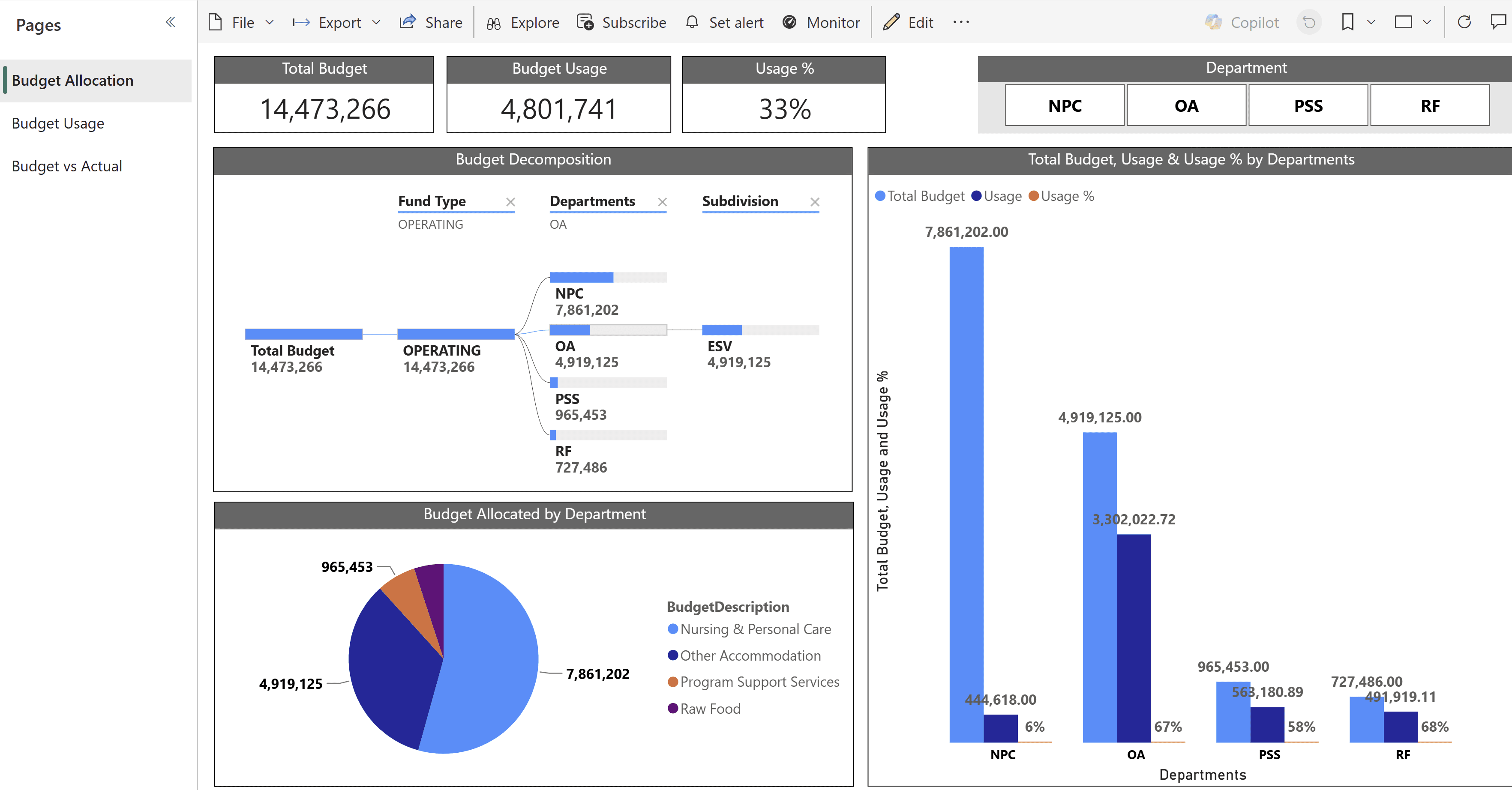
Budget control is where finance earns its seat at the table. This dashboard compares actual spend and revenue with the approved budget, highlights variances that need explanation and lets budget holders see their own position without asking finance.
- KPIs: budget, actual, variance and variance percentage, year-to-date usage, forecast to year end
- Key visuals: variance bar chart by department, a decomposition tree from total budget down to fund type, department and subdivision, budget versus usage by department
- Data sources: Business Central G/L budget entries alongside G/L entries; D365 Finance budget register entries and budget control data alongside actuals
- Refresh: daily for spend-heavy departments, otherwise weekly; budgets refresh when revisions are approved
6. Revenue and Sales Performance
Finance and sales often argue about revenue because they look at different numbers. A shared revenue dashboard built on posted invoices and credit memos ends that debate and shows which customers and products drive growth.
- KPIs: invoiced revenue, revenue growth, average order value, revenue by customer, item category and salesperson, credit memos as a percentage of revenue
- Key visuals: revenue trend with prior-year comparison, top customers and items, a map or region breakdown where relevant
- Data sources: Business Central sales invoice and credit memo lines, value entries and customer data; D365 Finance customer invoice journals and lines, and sales order data where open orders are included
- Refresh: daily
7. Inventory Value and Turns
Inventory is cash sitting on shelves. This dashboard gives finance and operations a shared view of inventory value, how quickly it moves and where slow-moving stock is building up.
- KPIs: inventory value by location and category, inventory turns, days on hand, slow-moving and obsolete value, value reconciled to the general ledger
- Key visuals: value by location and category, ageing bands for stock, a slow-mover table with last movement date
- Data sources: Business Central item ledger entries and value entries; D365 Finance inventory transactions, on-hand inventory and inventory value data
- Refresh: daily; reconcile inventory value to the balance sheet after each close
8. Project Profitability and WIP
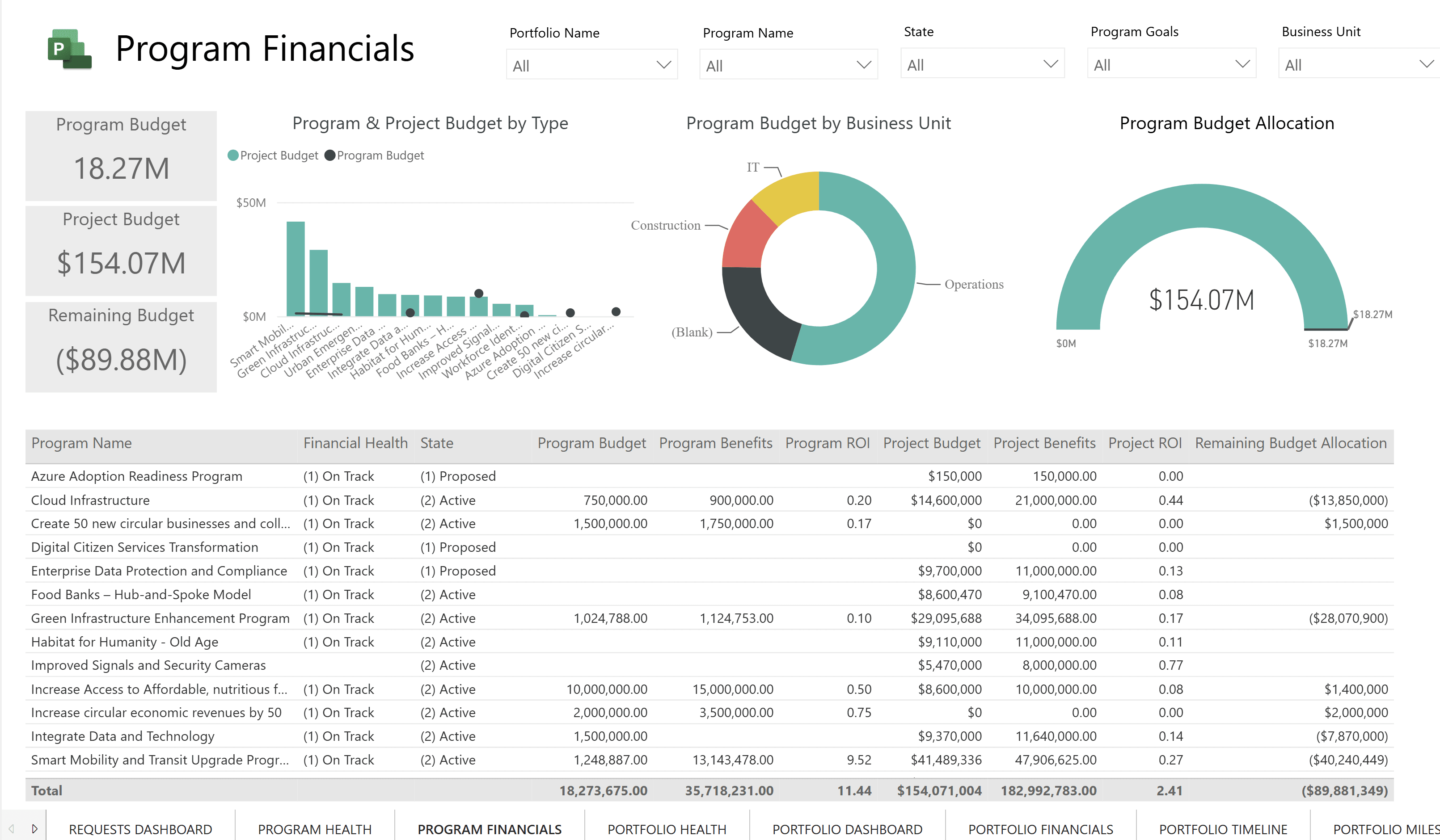
For project-based businesses, project profitability is the dashboard that matters most. It should show budget, cost, billing and margin by project, with early warning of overruns and unbilled work in progress.
- KPIs: project budget, actual cost, billed revenue, margin and margin percentage, remaining budget, unbilled WIP, estimate at completion
- Key visuals: project portfolio table with financial health status, budget by type and business unit, remaining budget gauges
- Data sources: Business Central project (job) ledger entries, project planning lines and project tasks; D365 Finance project transactions, project budgets and forecasts; organizations on Dynamics 365 Project Operations add project data held in Dataverse
- Refresh: daily; weekly snapshots support trend analysis of estimate at completion
9. Balance Sheet and Financial Ratios
The balance sheet dashboard gives the board and lenders a quick read on financial health. It is also the place to monitor covenant ratios so there are no surprises at quarter end.
- KPIs: current ratio, quick ratio, debt to equity, working capital, return on assets, covenant headroom
- Key visuals: a balance sheet matrix with period comparison, ratio cards with thresholds, trend lines for working capital
- Data sources: Business Central G/L entries and account categories; D365 Finance general journal account entries and main account categories, aligned with financial reporting definitions
- Refresh: after each period close, with a daily view available for working capital
10. Multi-Entity Group Performance
Groups with several companies or legal entities need a view across all of them. This dashboard shows how each entity contributes to revenue, margin and cash, in a common currency.
- KPIs: revenue, margin and cash by entity, entity contribution to group results, intercompany balances outstanding, currency-translated totals
- Key visuals: entity comparison bars, a group P&L with entity slicer, intercompany balance matrix
- Data sources: Business Central companies combined in the model, or consolidation company data; D365 Finance legal entities, consolidation results and intercompany transactions
- Refresh: daily for operational views; consolidated figures after each close
| # | Dashboard | Primary owner | Suggested refresh |
|---|---|---|---|
| 1 | Cash position and forecast | CFO or treasury | Daily |
| 2 | Receivables and collections | Credit manager | Daily |
| 3 | Payables and payment planning | Controller | Daily |
| 4 | P&L and gross margin | CFO | Daily, snapshot at close |
| 5 | Budget vs actual | FP&A | Daily or weekly |
| 6 | Revenue and sales performance | CFO and sales lead | Daily |
| 7 | Inventory value and turns | Controller and operations | Daily |
| 8 | Project profitability and WIP | Project finance | Daily |
| 9 | Balance sheet and ratios | CFO | After each close |
| 10 | Multi-entity group performance | Group controller | Daily and after close |
Build the Data Model Before the Dashboards
Every dashboard above depends on the same core: a clean chart of accounts, consistent dimensions, a calendar aligned to your fiscal periods and measures that reconcile to the trial balance. Building that foundation once, as a shared semantic model, is what lets ten dashboards agree with one another and with the ERP.
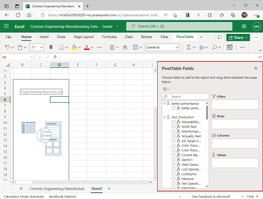
Where Power BI meets Excel, the same model can serve analysts who prefer to work in spreadsheets, without anyone exporting raw ledger data. That keeps ad-hoc analysis inside the governed boundary.
- Chart of accounts mapped to reporting categories and P&L and balance sheet lines
- Financial dimensions or dimension sets agreed and consistently populated
- Fiscal calendar table aligned with ERP accounting periods
- Company or legal-entity table with reporting currency and exchange rates
- Core measures defined once: revenue, margin, DSO, DPO, variance
- Trial balance reconciliation measure that ties the model to the ledger
- Customer, vendor, item and project tables with clean keys
- Incremental refresh planned for large ledger and value entry tables
- Row-level security designed by entity, department or project
- Naming conventions and descriptions for every measure
- Certified dataset and development, test and production workspaces
- Refresh failure alerts and an owner for each scheduled refresh
Security by role
Use row-level security so budget holders, entity controllers and project managers see only their own data.
Certified models
Endorse one finance model so every report draws on the same definitions and numbers.
Access and licensing
Plan who publishes and who views. Confirm current Power BI licensing with Microsoft or your partner.
Refresh discipline
Match refresh frequency to the decision, monitor failures and publish the last-refreshed time on every page.
Do not let numbers disagree with the ledger
The fastest way to lose a CFO's trust is a dashboard that does not match the trial balance. Build a reconciliation check into the model, show it on an admin page, and resolve every difference before rolling a dashboard out. A slightly plainer dashboard that always reconciles beats a beautiful one that sometimes does not.
Which Dashboard to Build First
There is no single correct starting point; it depends on where the business feels pressure today. The guide below helps you choose a first dashboard that delivers visible value quickly and builds momentum for the rest.
- IfCash is tight or lenders are watching closelyThenStart with the cash position and receivables dashboards
- IfLeadership questions where margin is being made or lostThenStart with P&L and gross margin by dimension
- IfDepartments overspend without early warningThenStart with budget vs actual and give budget holders access
- IfProjects regularly overrun or WIP is unclearThenStart with project profitability and WIP
- IfSeveral entities report in different waysThenStart with the shared model and the multi-entity dashboard
A Four-Wave Rollout Order
Rolling out in waves lets the team prove the model, gather feedback and build adoption before adding complexity. The allocation below is a suggested planning split across the four waves, not a measured benchmark.
Wave 1: Foundation and cash
Build the shared finance model, reconciliation checks and security, then deliver cash position, receivables and payables.
Wave 2: Performance
Add P&L and gross margin, revenue and sales performance, and budget vs actual for budget holders.
Wave 3: Operations and projects
Add inventory value and turns and project profitability and WIP, working with operations and project leads.
Wave 4: Board and group view
Add the balance sheet and ratios and multi-entity group performance, then publish a leadership app.
- Wave 1 foundation and cash40%
- Wave 2 performance25%
- Wave 3 operations and projects20%
- Wave 4 board and group view15%
Wave 1 carries the most effort because the data model, security and reconciliation work happens there; later waves reuse it. Teams that try to skip the foundation usually rebuild it later at greater cost. Pair the rollout with the finance process improvements in our article on ERP automation strategies for finance teams, so dashboards reflect cleaner, faster-closing data.
Publish dashboards as an app, not a folder of reports
A Power BI app gives finance and leadership one place to find approved dashboards, with navigation, descriptions and controlled updates. It also separates what is ready for decision-making from work in progress in development workspaces.
How Econix Helps
Econix builds finance analytics on Power BI for organizations running Business Central and Dynamics 365 Finance across Canada and the USA. We design the shared finance model, connect it to your ERP using the right data path for your volumes, and deliver dashboards in waves that your team owns and trusts.
Our professional services financial automation case study shows how better data flows and reporting reduce manual effort for finance teams. If your ERP data needs attention before analytics can be trusted, an ERP health check identifies the configuration and data issues to fix first, and Support 365 keeps reports and refreshes healthy as your business changes.
Related Reading
- ERP Automation Strategies for Finance Teams - cleaner, faster finance processes that make dashboards more reliable
- Dynamics 365 Finance: Business Problems Solved - where D365 Finance strengthens control and reporting
- Business Central or Dynamics 365 Finance: Which Fits? - choosing the right ERP foundation for your reporting needs
- ERP Integration Best Practices - connecting ERP data to analytics and other systems
- ERP Optimization Strategies for Growing Companies - getting more value from the ERP you already run
Econix Infotech
Ready to give finance dashboards it can trust?
Talk to Econix about building a governed Power BI finance model on Business Central or Dynamics 365 Finance.